Graphs and Data Teaching Resources
Teach graphing this school year with printable worksheets, fun graphing activities and games, task cards and more teacher-created resources for primary school maths!
This collection of editable teacher-created resources is aligned with the Australian curriculum. It has been carefully reviewed by the expert teachers on the Teach Starter team to ensure every single digital or printable resource is ready to use in the classroom. That means you can save hours on lesson planning with activities ready to print or use digitally!
Are you looking to learn more about teaching students to use graphs, or just on the hunt for fresh ideas and activities to engage your students? Read on for a primer from our teacher team, including a look graphing on this level and some key vocabulary!
What Is Graphing? A Kid-Friendly Definition
Graphing starts in the early years in many schools around Australia with simple pictographs. But how do you explain what graphing is to the youngest students? This kid-friendly definition may help.
Graphing is a way to show information using pictures and symbols. It's sort of like drawing a picture that helps you understand numbers and facts.
For example, we could use graphs to show how many kids in our class like different colours or how many toys in the toy bin are cars.
Graphing Vocabulary for Primary Teachers
Looking for a guide to some of the graphing vocabulary your students will encounter — and you will have to define? Here's a comprehensive look, along with some simple definitions!
- Data —Information that is collected and analysed
- Axis — The horizontal and vertical lines that make up a graph.
- X-axis — The horizontal axis on a graph
- Y-axis — The vertical axis on a graph
- Bar — A rectangular shape we use to represent data on a bar graph
- Scale — The units used to measure data on a graph
- Pictogram/pictograph — A graph that uses pictures to represent data
- Legend/key — A chart that explains the symbols used on a graph (students may recognise this from their map skills lessons)
- Line of best fit — A straight line on a graph that represents the overall trend in a set of data
- Line plot — A graph that shows the frequency of data values on a number line
- Tally — A mark used to represent data on a tally chart
- Pie chart — A graph that shows the proportion of each data value to the whole, represented as a circle that looks like a pie
- Line graph — A graph that shows the relationship between two variables using a line
- Data point — An individual value on a graph
- Plus Plan
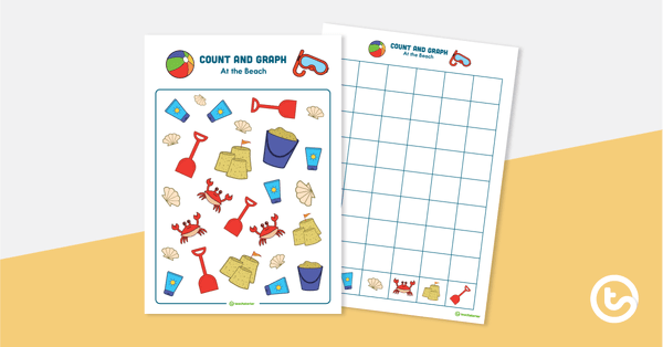
Count and Graph – At the Beach
A beach-themed hands-on activity to introduce graphing skills.
- Plus Plan
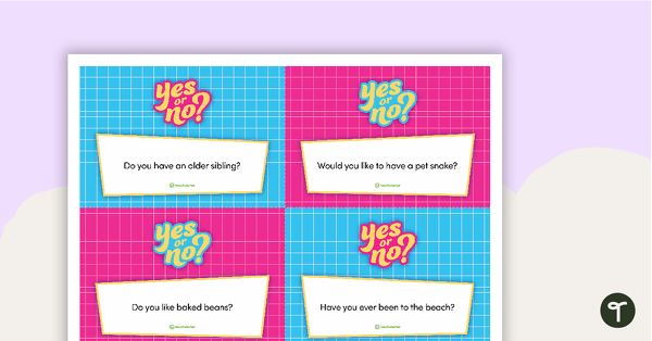
Yes or No? Questions – Flashcards
A set of 20 flashcards posing 'yes or no' questions for your students to answer.
- Plus Plan

Search and Find – Valentine's Day
A fun search and find activity for Valentine's Day.
- Plus Plan
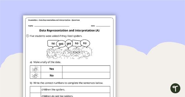
Data Representation and Interpretation Worksheets - Foundation
2 data representation and location worksheets linked to the Australian Curriculum.
- Plus Plan
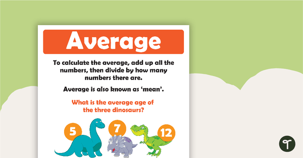
How To Calculate The Average Poster
A set of two posters which clearly show how to calculate the average of a group of numbers.
- Plus Plan
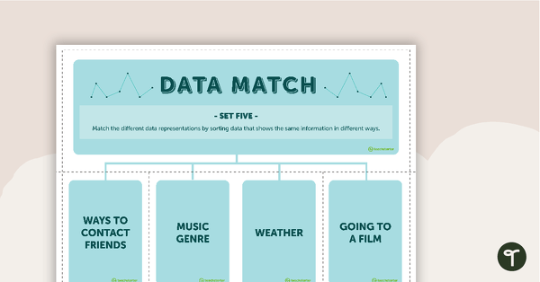
Data Match-Up Cards (Set 5)
A match-up activity for students to use when exploring data.
- Plus Plan
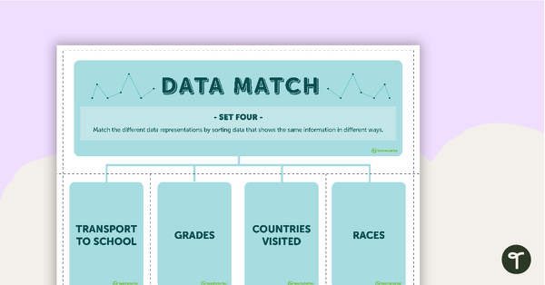
Data Match-Up Cards (Set 4)
A match-up activity for students to use when exploring data.
- Plus Plan
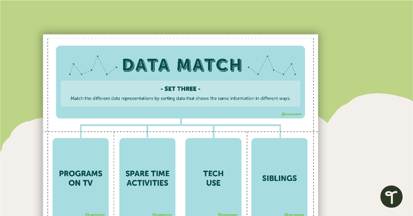
Data Match-Up Cards (Set 3)
A match-up activity for students to use when exploring data.
- Plus Plan
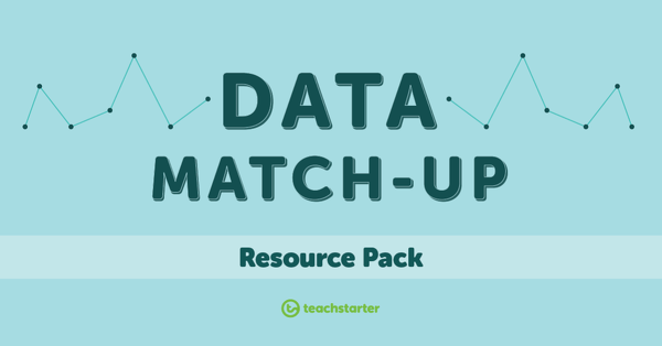
Data Match-Up Cards Resource Pack
A match-up activity resource pack for students to use when exploring data.
- Plus Plan
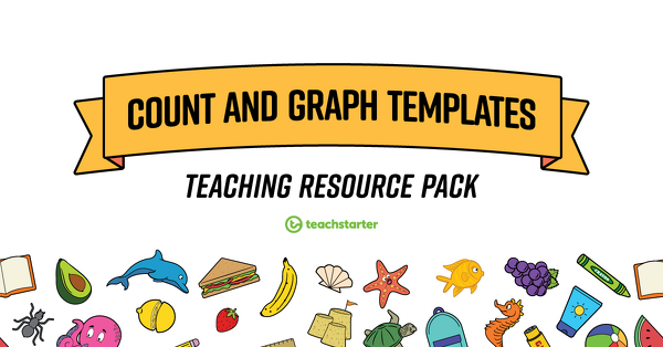
Count and Graph Templates
A collection of theme-based Count and Graph templates.