Teks
Math 6.12(D)
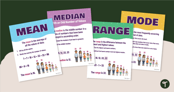
summarize categorical data with numerical and graphical summaries, including the mode, the percent of values in each category (relative frequency table), and the percent bar graph, and use these summaries to describe the data distribution.
Show more
1
teaching resource for those 'aha' moments