Use our misleading statistics teaching slides to increase statistical literacy and teach your students how to look at data displays with a critical eye.
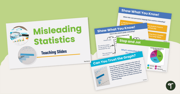
Uncover Dubious Data Displays With Our Misleading Statistics Teaching Slides
Help your students become savvy data detectives with our Misleading Statistics Teaching Slides! This resource is designed to equip students with the critical thinking skills they need to spot misleading data representations in everyday media. Perfect for classroom discussions and independent reflection, these slides explore how graphs can be manipulated to influence opinions—whether through distorted axes, missing data points or inaccurate proportions.
Included in these Misleading Statistics Slides:
- Column graph, pie graph and line graph examples
- ‘Show What You Know’ questions
- ‘Turn and Talk’ discussion prompts
- ‘Stop and Jot’ reflection slides
Ideal for upper primary and secondary classrooms, this resource supports the Australian Curriculum’s focus on data interpretation and critical thinking. Empower your students to question what they see and become informed, analytical thinkers!
More About Our Misleading Graphs and Statistics Teaching Slides
This set of misleading graphs and statistics teaching slides includes examples of many different methods people use to manipulate data displays, including:
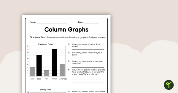
- A Y-axis that does not start at 0
- Uneven scales or time intervals
- Omitted data
- Pie chart pieces that are not to scale
- Differently sized symbols
- Missing labels or keys
- Missing or untrustworthy sources
After this lesson, your students will be able to spot these and many more misleading statistics in the wild!
How to Download Our Misleading Graphs Powerpoint
This misleading graphs Powerpoint is also available in Google Slides format. To download, click the drop-down arrow on the download button and choose the format you prefer.
This resource was created by Kendall Britnell, a teacher and a Teach Starter collaborator.
More Statistical Literacy Resources
We have additional statistical literacy resources at your fingertips! Check out a few below.
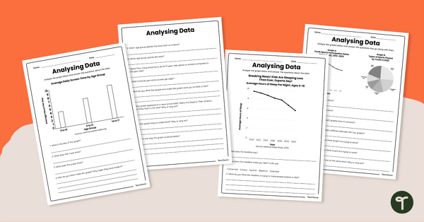
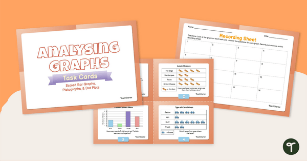
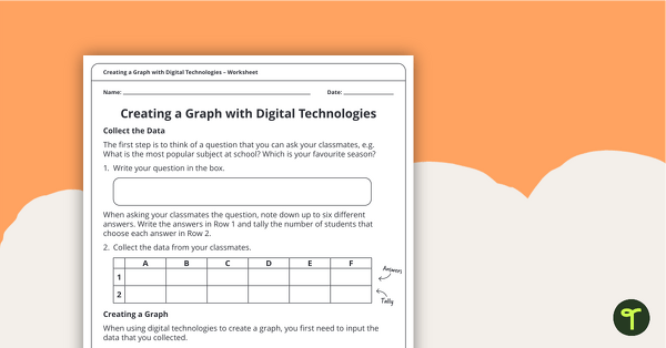
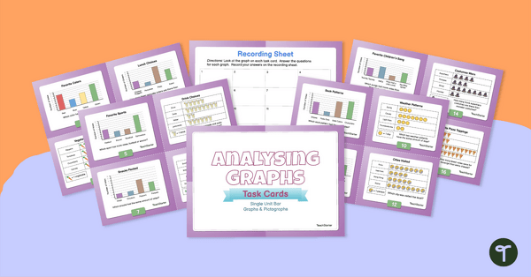
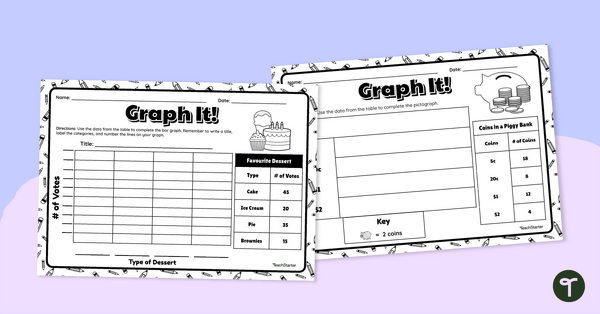
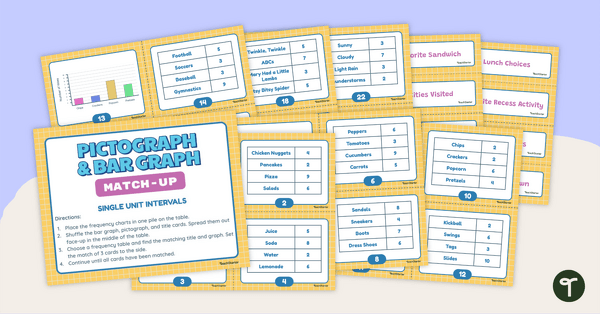
Download our misleading graphs worksheet set to increase your students’ abilities in statistical literacy and data analysis. Share this analysing data worksheet set with your students to give them varied practice interpreting multiple data representations. Use data analysis skills to analyse scaled bar graphs, pictographs, and dot plots with this set of task cards.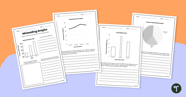
teaching resource
Misleading Graphs Worksheet Set
teaching resource
Analysing Data Worksheet Set
teaching resource
Analysing Graphs — Scaled Bar Graphs, Pictographs, & Dot Plots —Task Cards

0 Comments
Write a review to help other teachers and parents like yourself. If you'd like to request a change to this resource, or report an error, select the corresponding tab above.