Show students the varying data displays they will encounter in their primary maths lessons with these colourful and easy-to-digest visual posters.
Display the Types of Graphs and Graph Features!
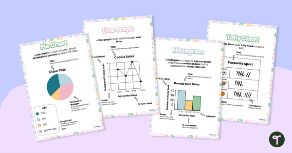
Use this poster set (containing 6 posters) to display in your math space to show your students the different types of graphs and their features. This colourful and easy-to-digest visual display shows students the varying data displays they will encounter in their primary maths lessons.
Graph types included are:
- Picture Graphs (also known as pictographs)
- Pie Charts
- Line Graphs
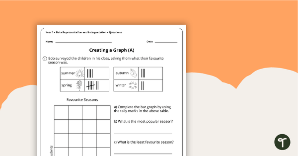
- Bar Graphs (horizontal and vertical displays)
- Histograms and
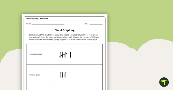
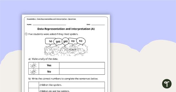
- Tally Charts.
Graphs are not only used in mathematics! Use these posters with your students when interpreting or creating graphs in other subjects, such as science and HASS!
Our Types of Graphs Posters Include the Following Information:
- Picture Graphs – A picture graph uses symbols and pictures to compare data. A key explains what each symbol means.
- Pie Chart – divided into sectors that each represent a proportion of the whole.
- Line Graph – A line graph uses points connected by lines to compare changes in data.
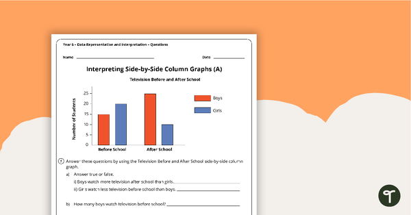
- Bar Graph – A bar graph uses horizontal bars to compare data. Categories are displayed on the vertical (y) axis and values on the horizontal (x) axis.
- Column Graph – A column graph uses vertical bars to compare data. Categories are displayed on the horizontal (x) axis and values on the vertical (y) axis.
- Histogram – A histogram shows the distribution of data in a range. Intervals are displayed on the horizontal (x) axis and values on the vertical (y) axis. On a histogram there is no space between the rectangles that display value.
How to Make the Most of Your Types of Graphs Posters
Maximise your use of this teacher-created resource a number of ways:
- Print the poster on larger paper and display it in your classroom for students to reference when doing independent work.
- Print the poster on regular paper, slip it into a clear sleeve, and use it in your guided groups as a reminder.
- Print the poster on regular paper, slide it into a clear sleeve, and hang it on a ring as a reference tool for a maths center.
We’ve also come up with bonus ways to turn posters into interactive tools that really make your lessons stick!
🖍️ Turn these posters into colouring pages by printing in black and white.
📝 Create a fill-in-the-blank worksheet by removing selections of text.
📂 Print 6-to-a-page and place copies in students’ homework folders for reference.
🧠 Test students’ memories by showing them the posters, then hiding it and having them tell you what they remember.
✅ Incorporate posters into your lesson wrap-up: students write on a sticky note what they learned from the lesson and place it on the posters.
Before You Download
This resource prints as a PDF.
Spend more time lesson-doing and less time lesson-planning when you grab these activities and teaching resources too!
This resource was created in collaboration with Kendall Britnell, a Teacher and Teach Starter Collaborator.

8 Comments
Write a review to help other teachers and parents like yourself. If you'd like to request a change to this resource, or report an error, select the corresponding tab above.
No comments yet.