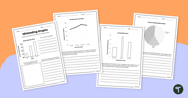
Download our misleading graphs worksheet set to increase your students’ abilities in statistical literacy and data analysis.
Increase Statistical Literacy With This Misleading Graphs Worksheet Set
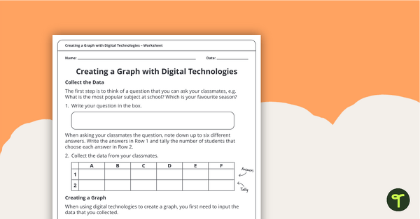
Help your students become savvy data interpreters with this engaging worksheet set focused on identifying and correcting misleading graphs. Each of the four worksheets presents real-world-style data visualisations that intentionally mislead through design choices—like distorted axes, inconsistent bar widths, or omitted data points.
Students will analyse each graph, explain what makes it misleading, and suggest or create improved versions. This activity is perfect for building critical thinking and media literacy skills. Answer keys are included for easy grading!
This misleading graphs worksheet set includes the following data displays:
- Bar graphs with visual distortions
- Pie charts with misleading proportions
- Line graphs with missing or manipulated time intervals
How to Spot Misleading Statistical Graphs
There are many ways that data can be manipulated and displayed to influence a target audience. Here are some things to look out for when trying to spot misleading statistical graphs. Share them with your students!
Axis Manipulation
- Truncated Y-Axis – Starting the Y-axis at a value other than zero exaggerates differences.
- Inconsistent Intervals – Uneven spacing on axes can distort trends or comparisons.
- Missing Time Periods – Omitting dates or intervals hides fluctuations or gaps in data.
Visual Distortion
- Varied Bar Widths – Wider bars can appear more significant even if the height (value) is the same.
- Pie Slices Not to Scale – Visual proportions don’t match actual data values.
Data Selection
- Cherry-Picking Data – Only showing data that supports a specific narrative.
- Omitting Context – Leaving out relevant comparisons or background information.
- Small Sample Sizes – Drawing broad conclusions from data from a small sample size.
Ambiguous or Misleading Labels
- Vague Categories – Labels that don’t clearly define what’s being measured.
- Inconsistent Units – Mixing units (e.g., percentages and raw numbers) without clarification.
See how many of these your students can spot in this misleading graphs worksheet set!
Download These Misleading Data Worksheets
These misleading data worksheets are available in both Google Slides and PDF formats. To download the set, click the drop-down arrow on the download button and choose the version that you prefer.
This resource was created by Kendall Britnell, a teacher and a Teach Starter collaborator.
Additional Data Analysis Worksheets
Want more data analysis worksheets and activities? We’ve got you covered! Check out the resources below.
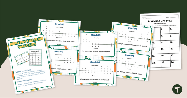
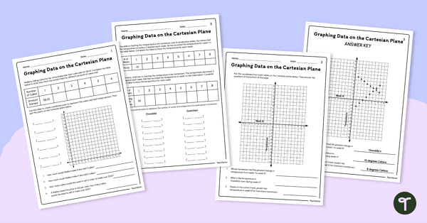
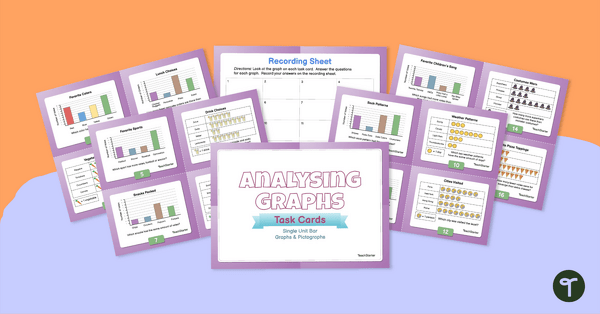
Use data analysis skills to analyse scaled bar graphs, pictographs, and dot plots with this set of task cards. Strengthen data analysis skills by interpreting dot plots with this set of 24 task cards. Introduce these graphing data worksheets to your students to give them practise graphing real-world situations on the Cartesian plane.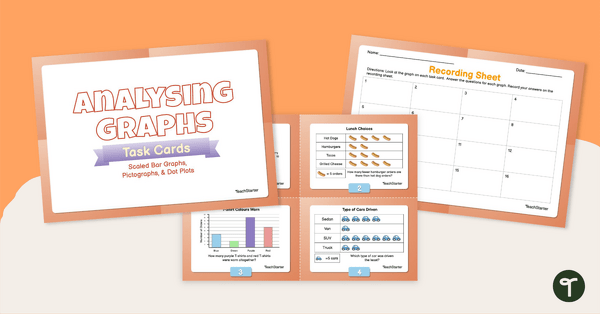
teaching resource
Analysing Graphs — Scaled Bar Graphs, Pictographs, & Dot Plots —Task Cards
teaching resource
Analysing Dot Plots Task Cards
teaching resource
Graphing Data Worksheets (Cartesian Plane)


0 Comments
Write a review to help other teachers and parents like yourself. If you'd like to request a change to this resource, or report an error, select the corresponding tab above.